Vaporwave, Memphis and Brutalism
Summary
EVERYTHING ON THIS SITE IS STOLEN, I JUST DID THE WEBSITE!
And should be handled as STOLEN for the sake of information, just as Vaporwave is. This is the documentary of mine trying to get into DESIGN and the website is the result of the project. This is the summary from the best internet-articles I found in the year 2018.
I thought for some reasons that I NEED to take this website to my personal hoster around 2019 and somehow lost the access all along, losing the website in process as well. Found the files almost 4 years (2023) later its now online again. Sorry.
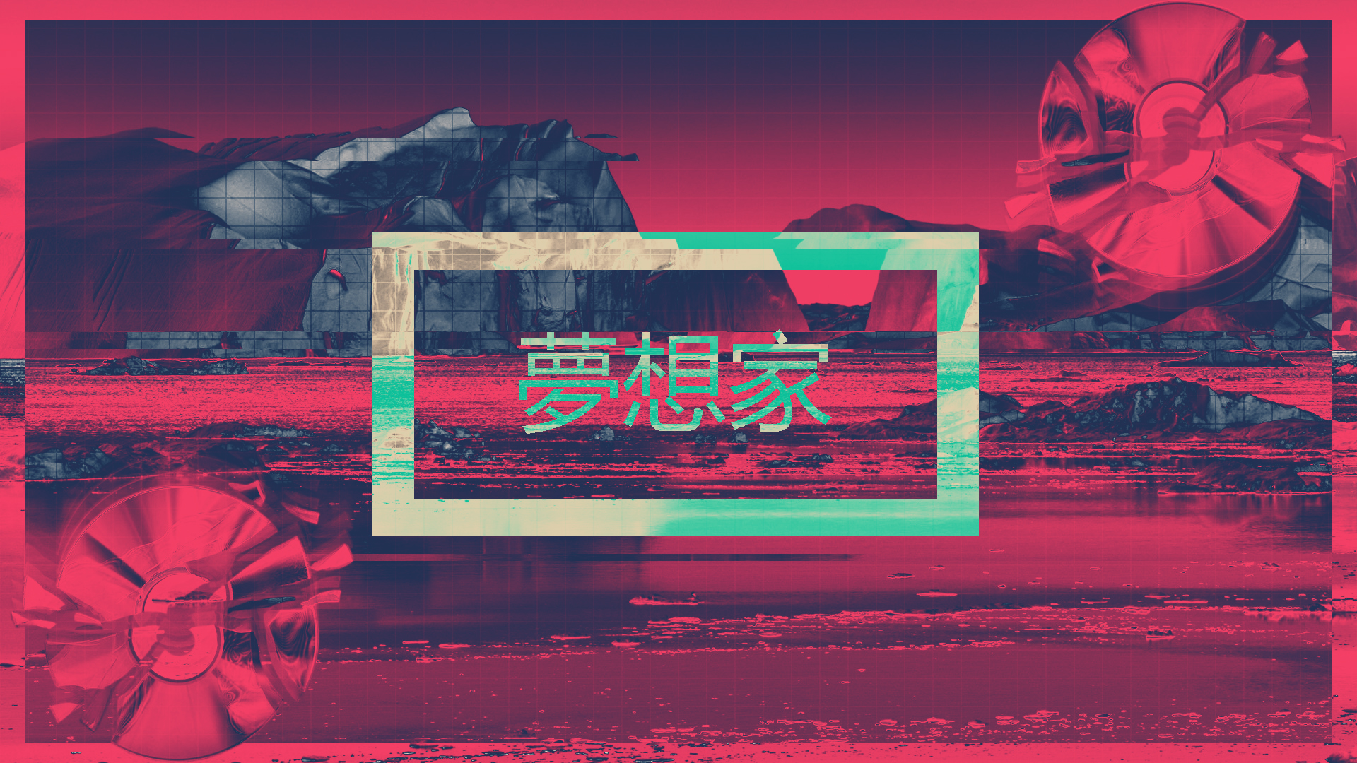
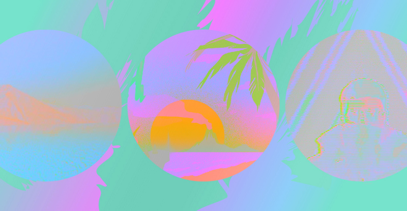
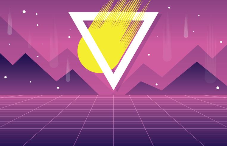
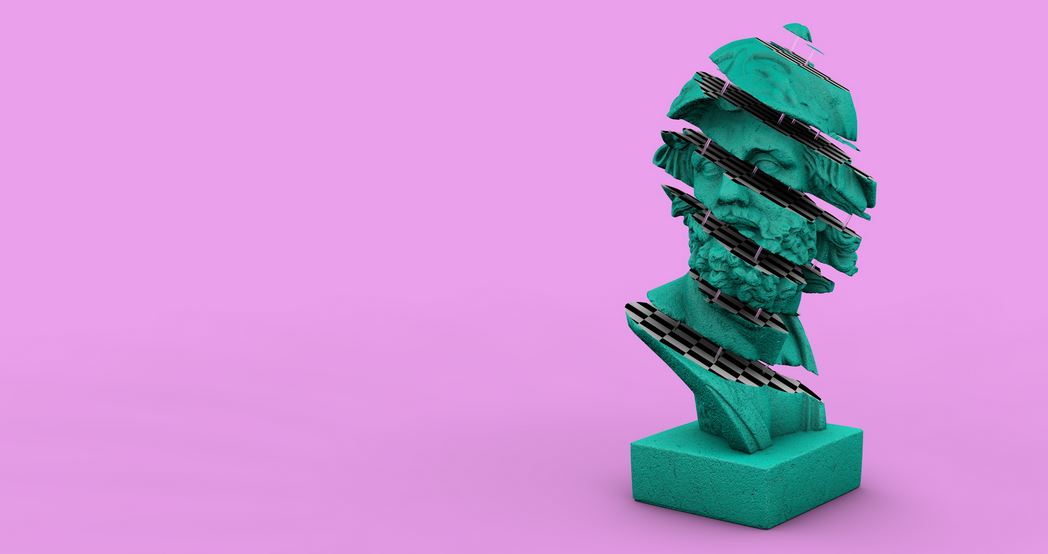
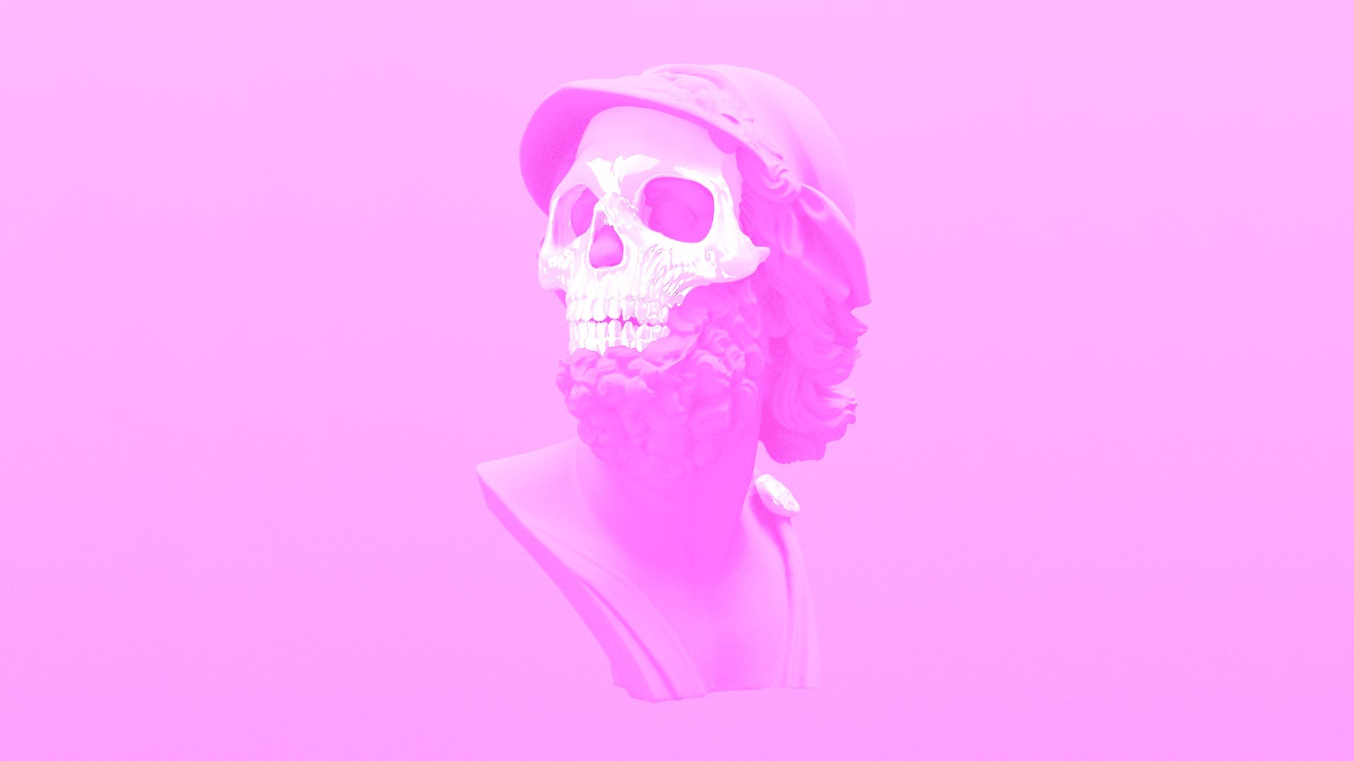
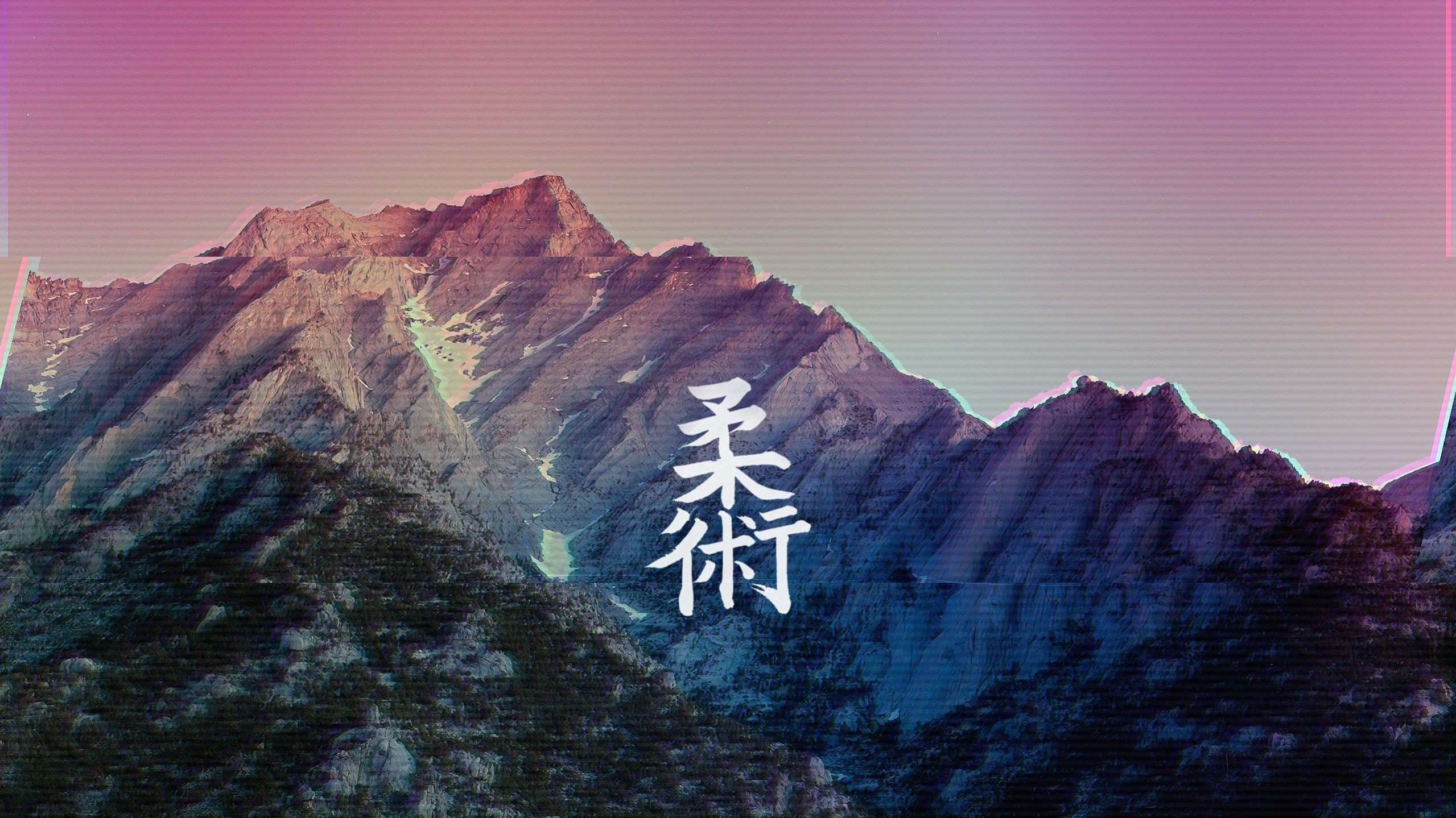
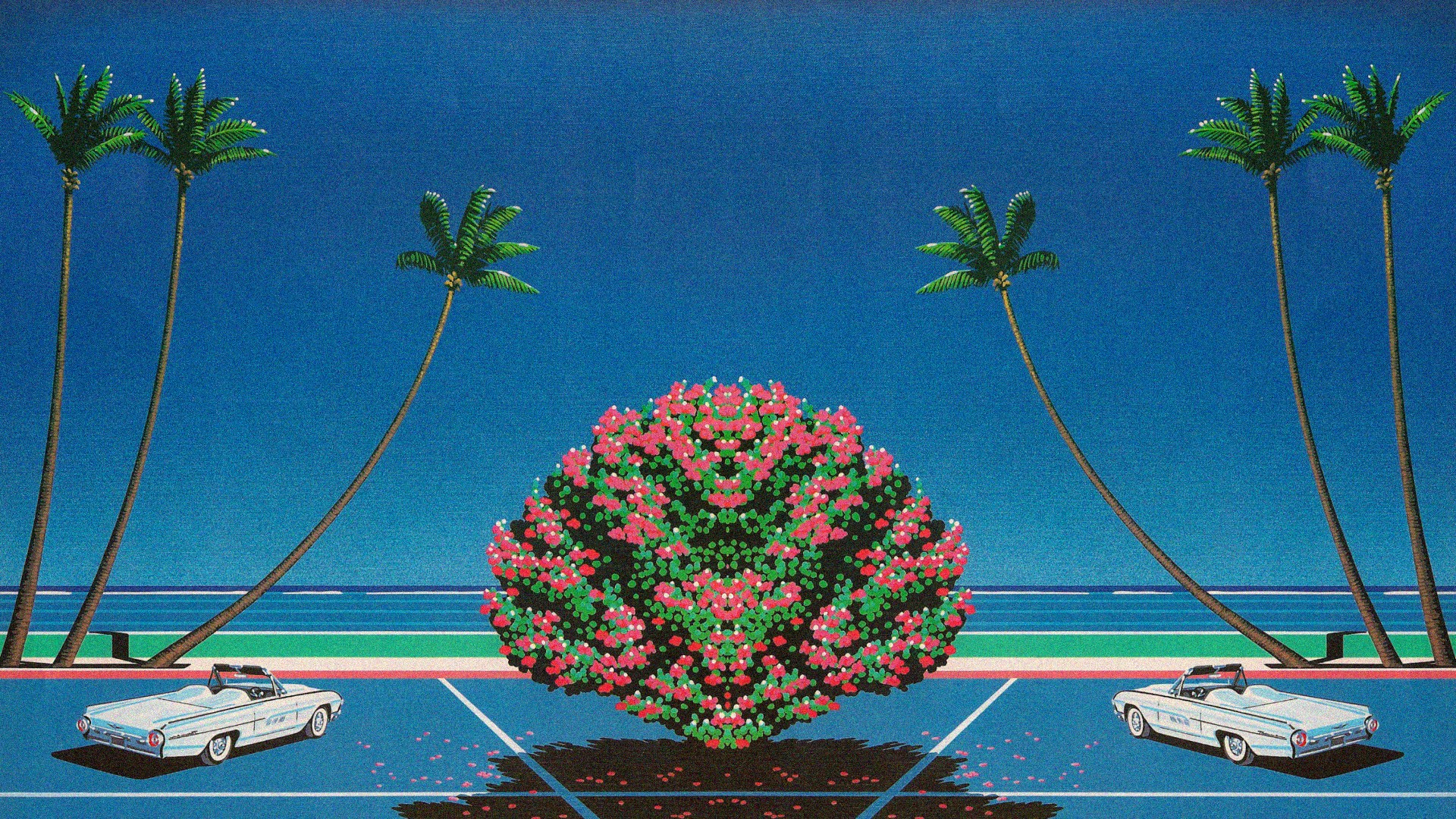
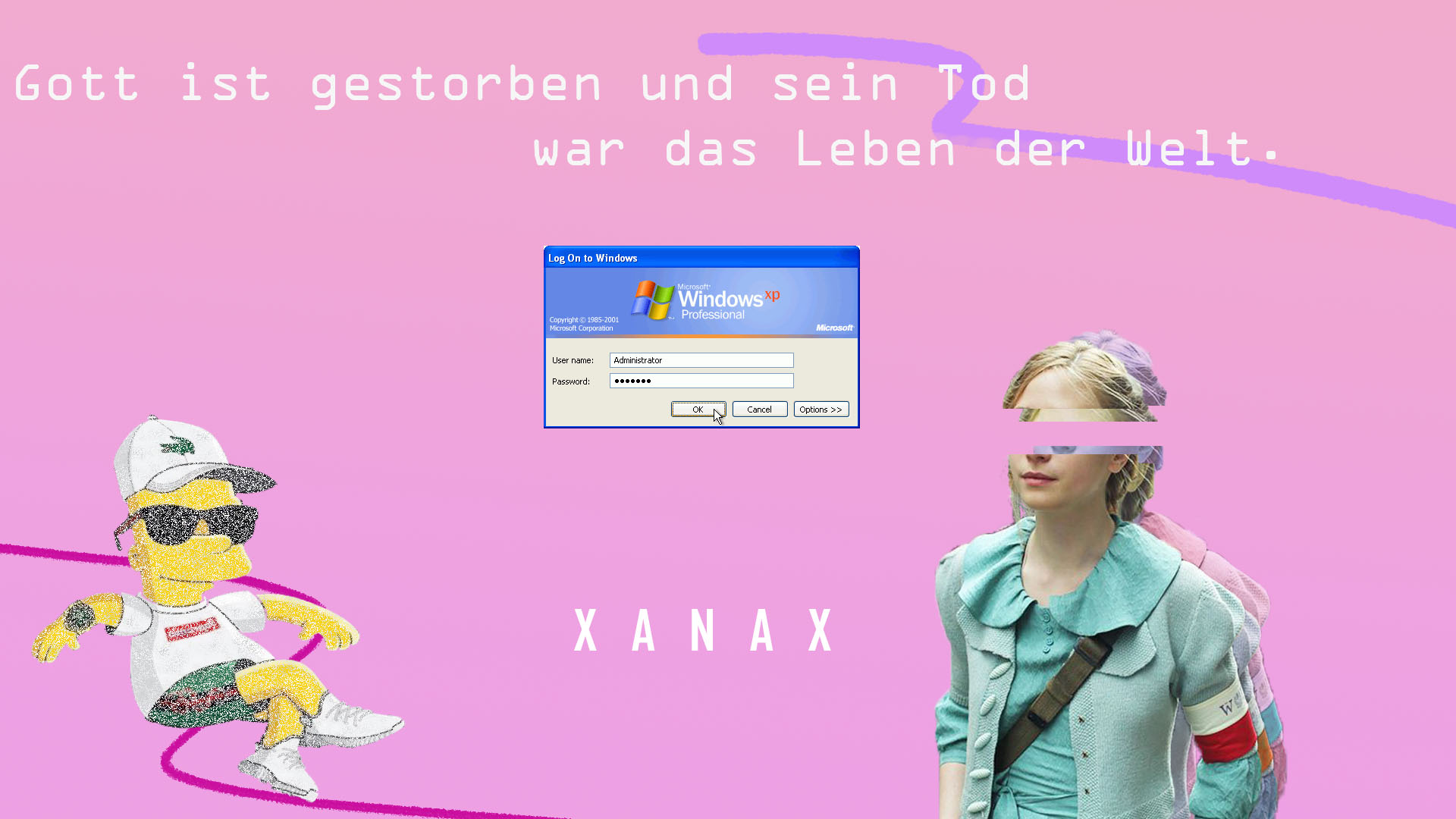
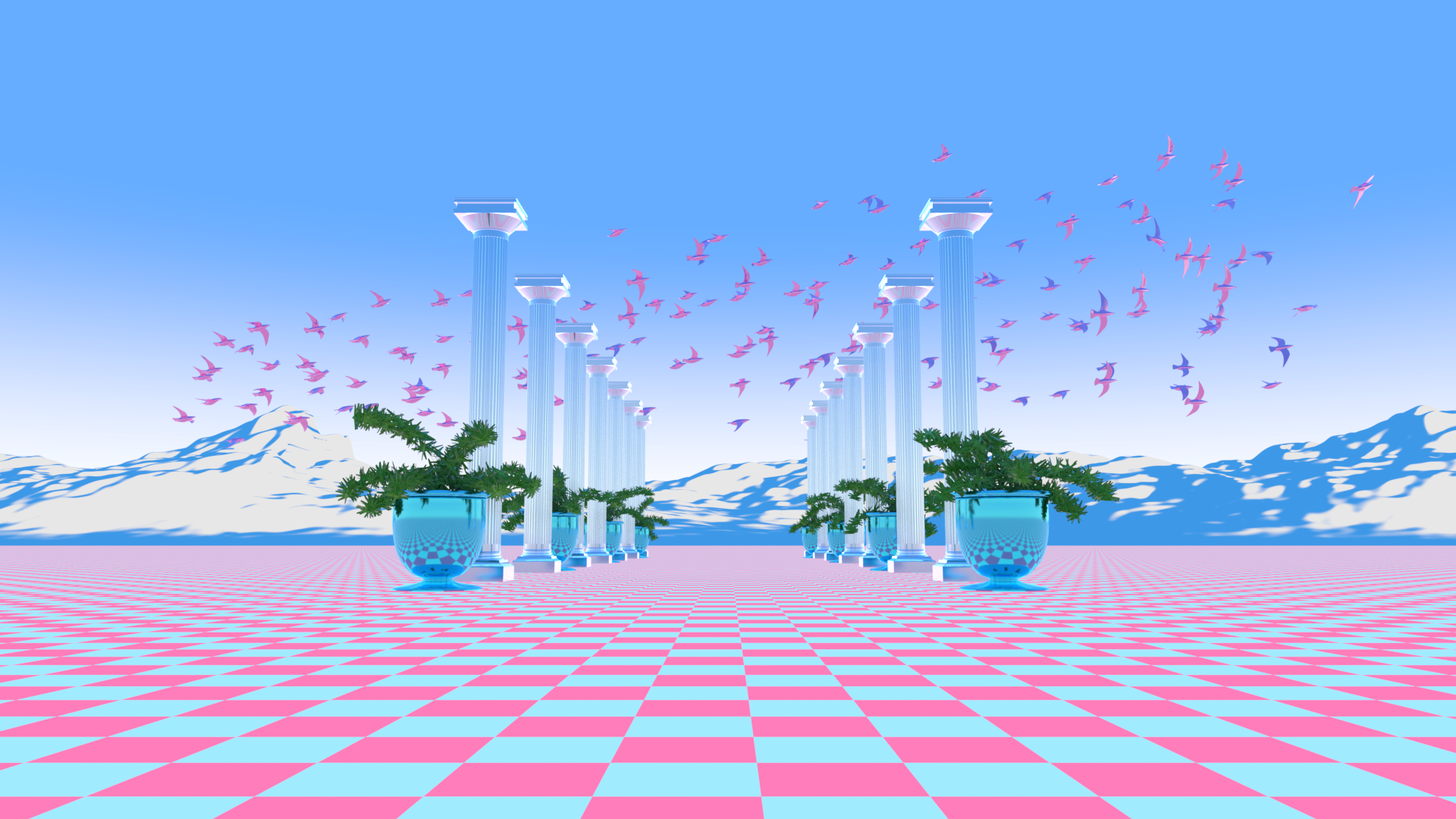
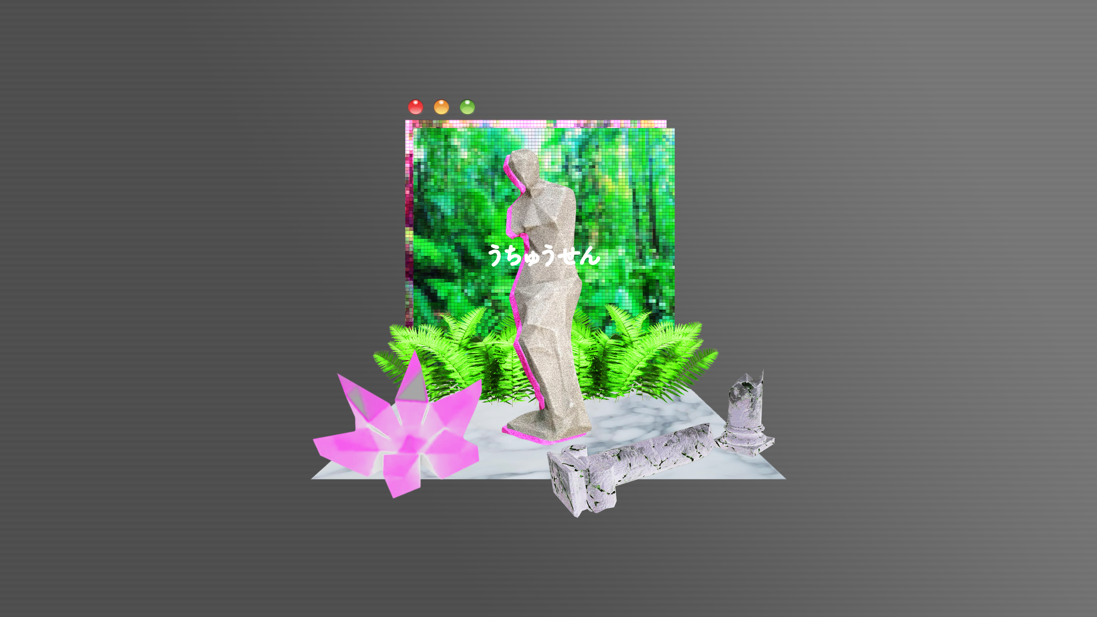
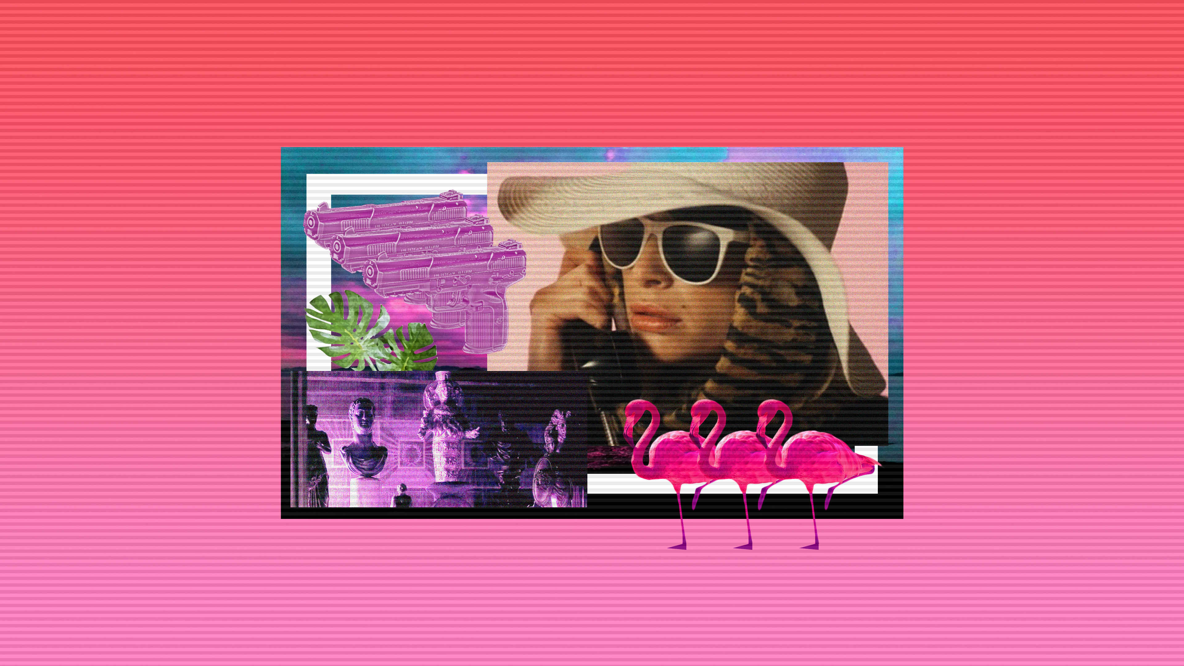
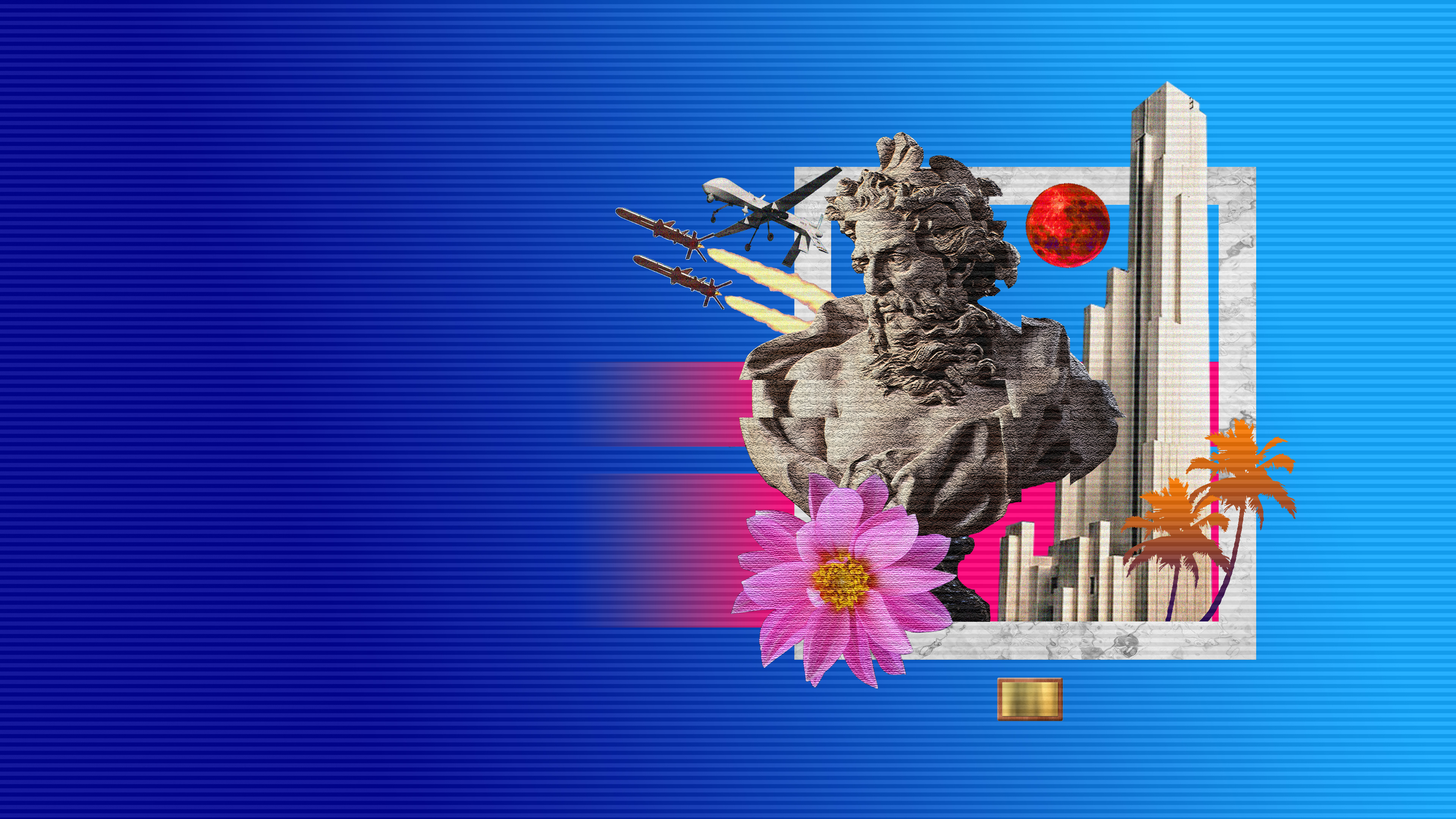
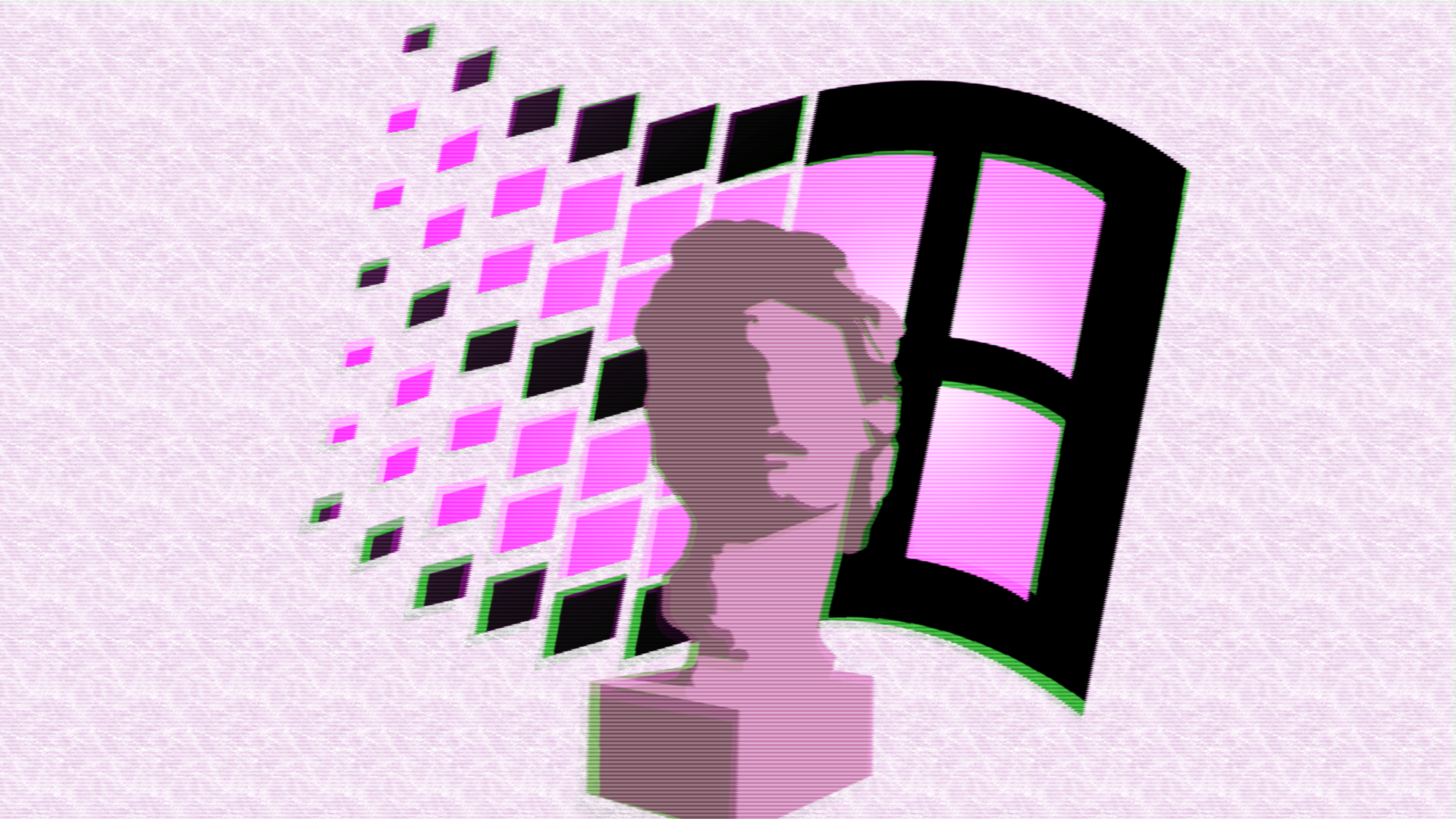
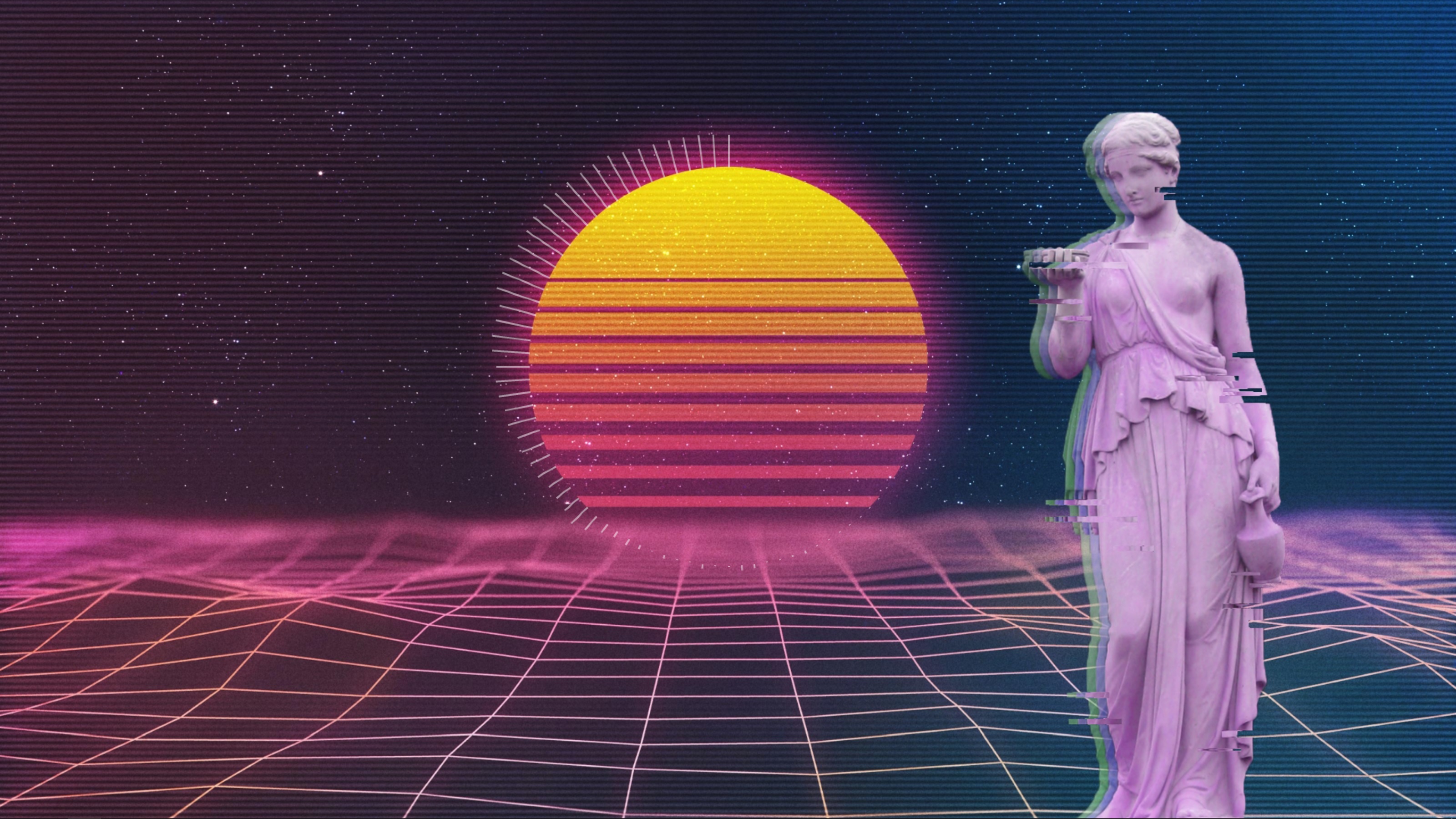
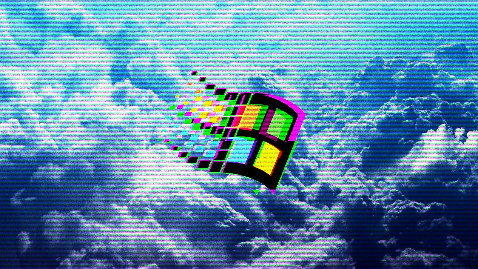
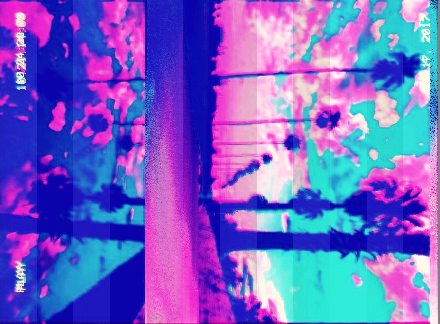
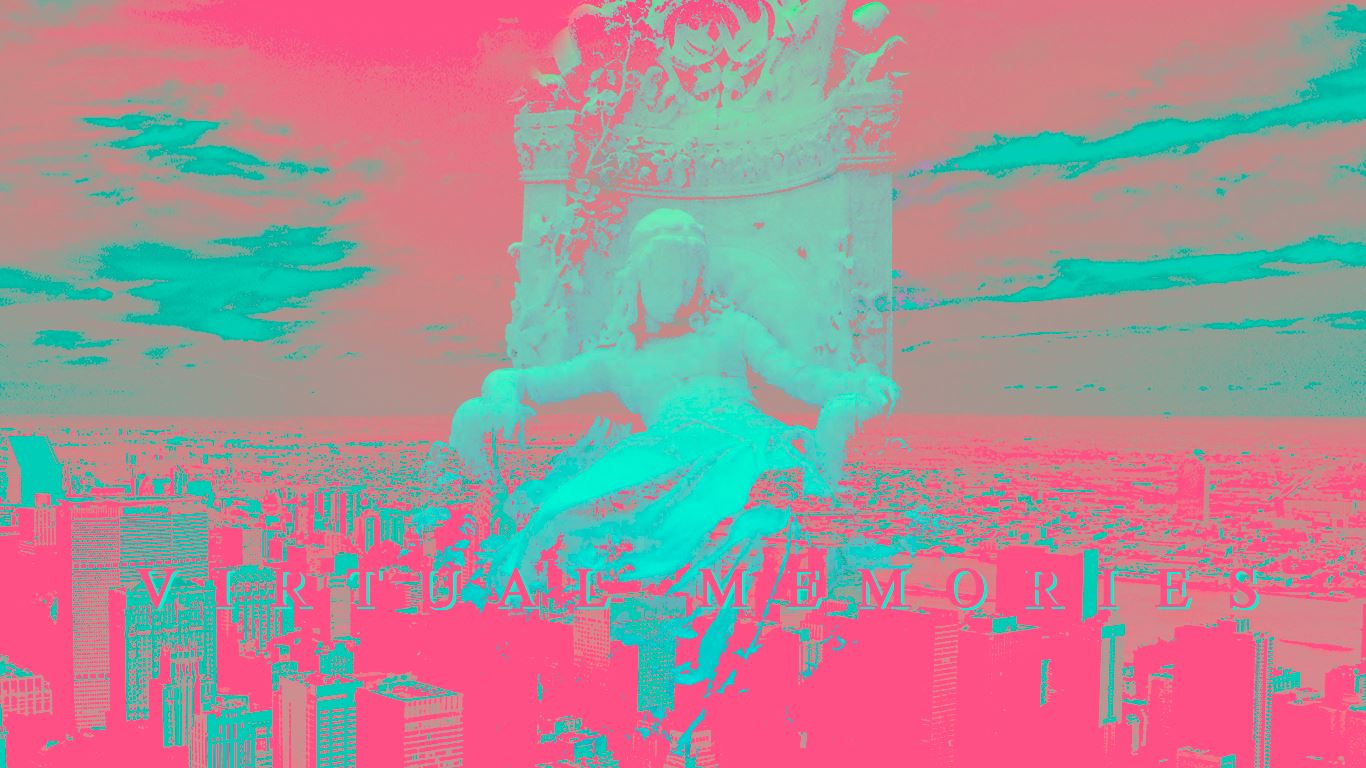
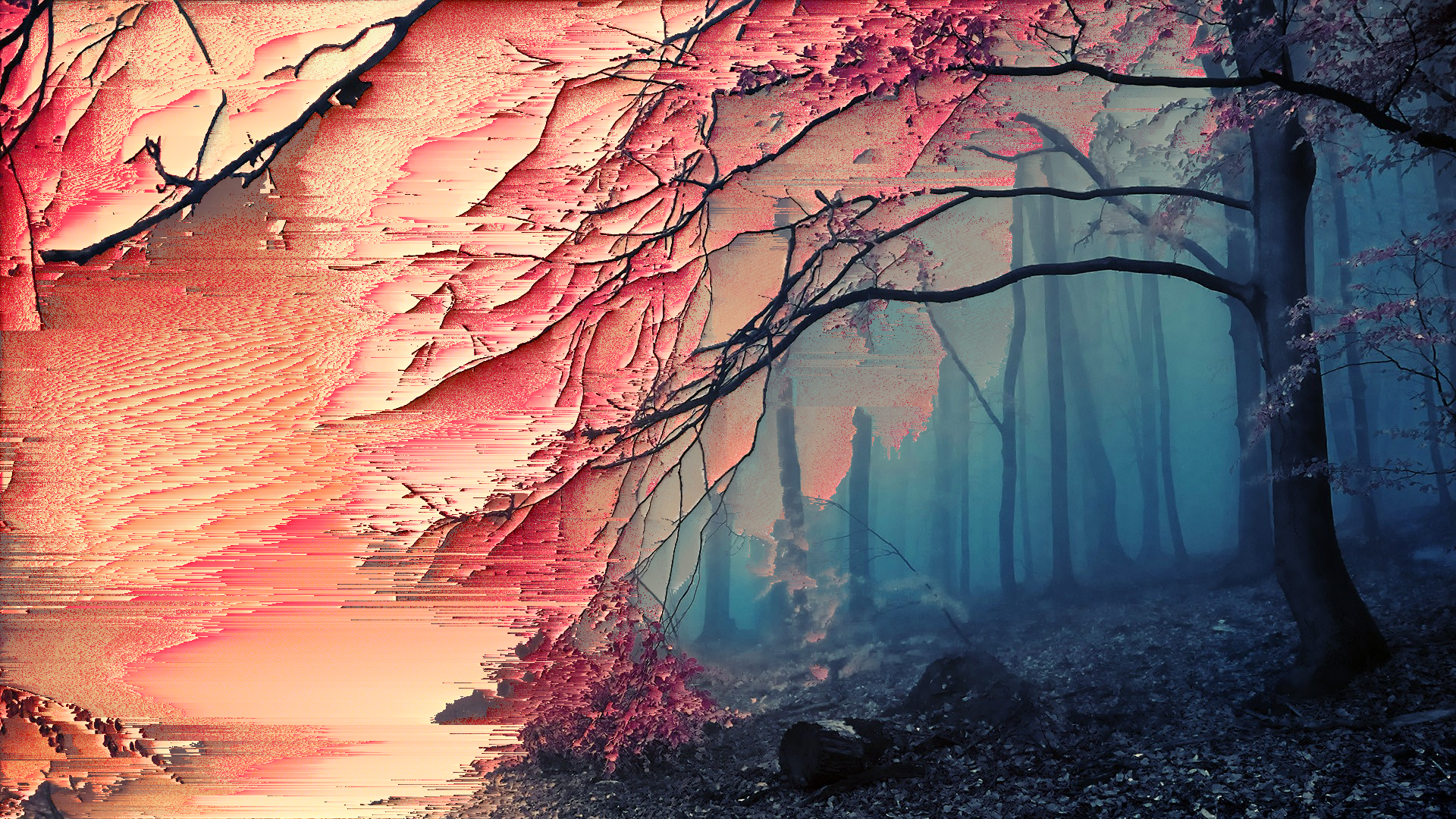
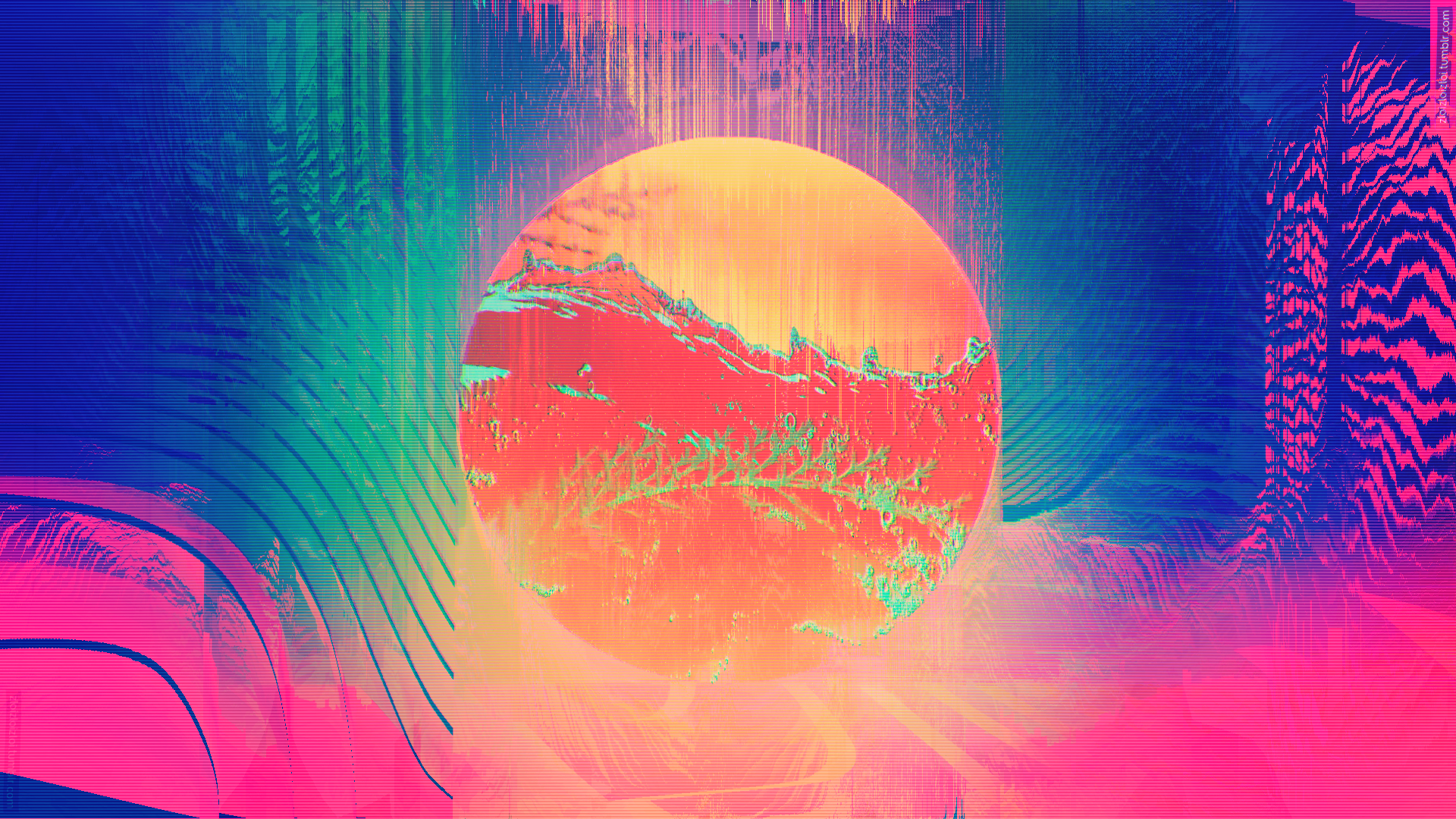
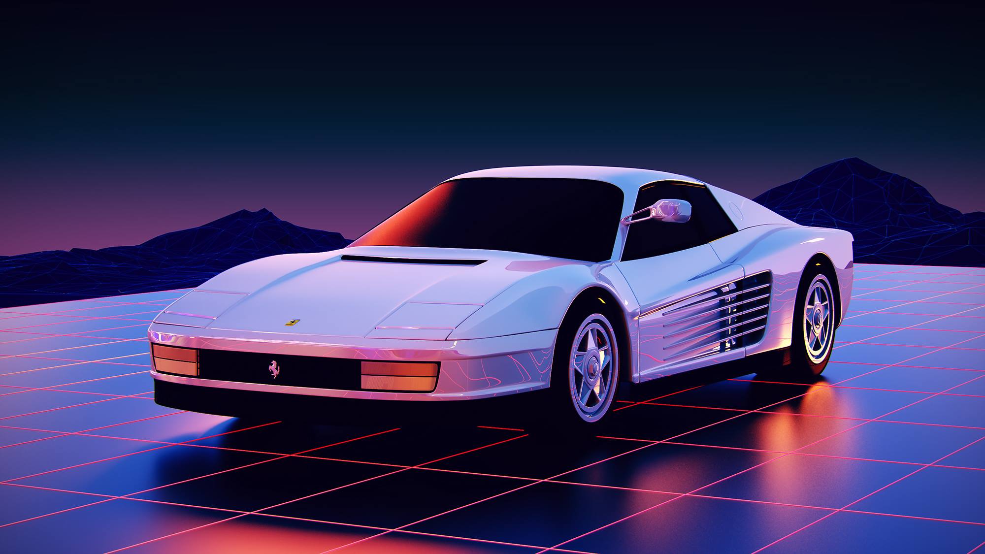
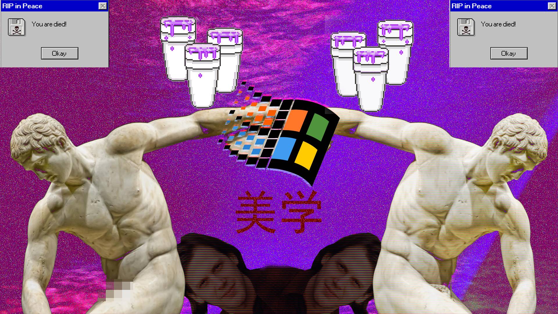
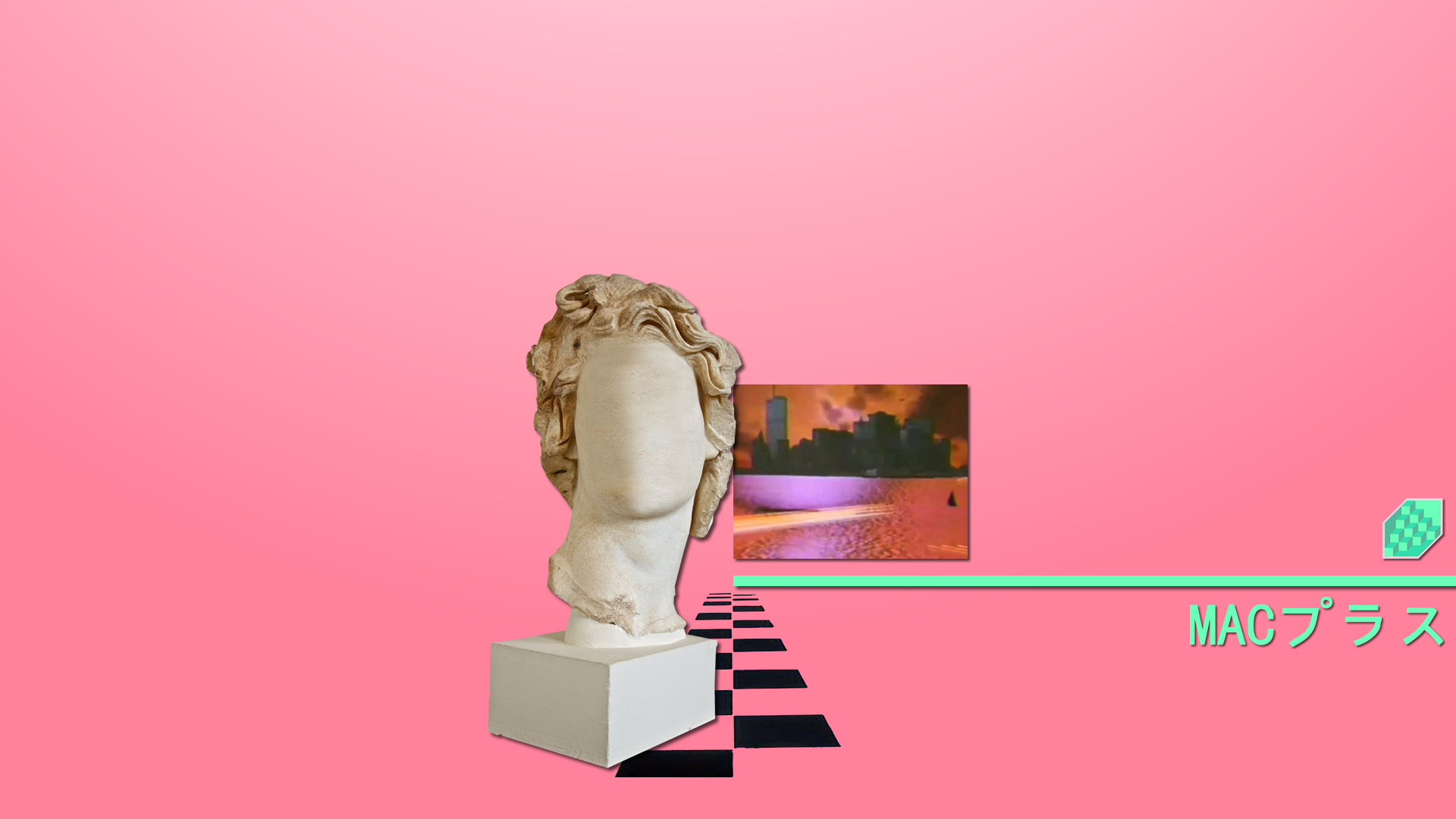
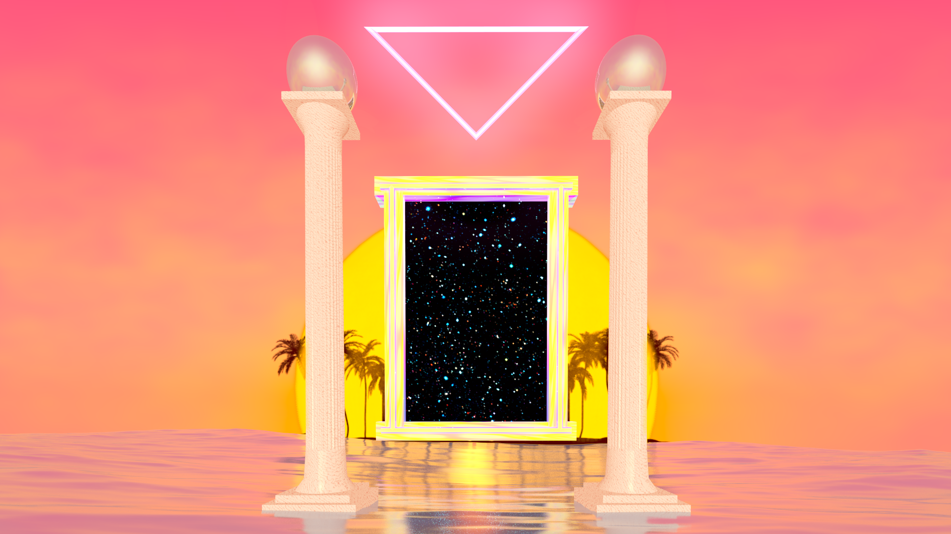
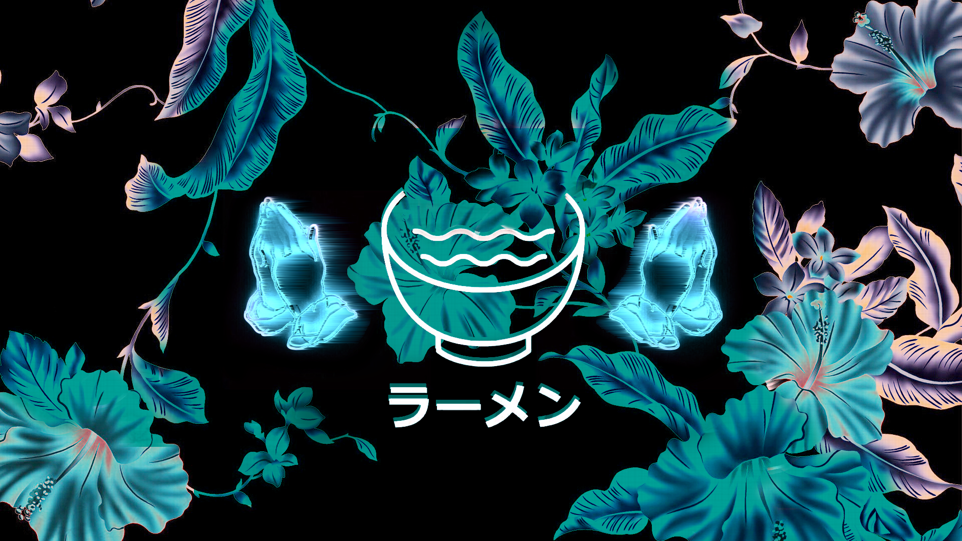
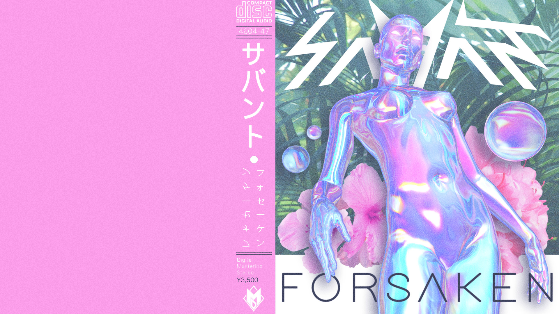
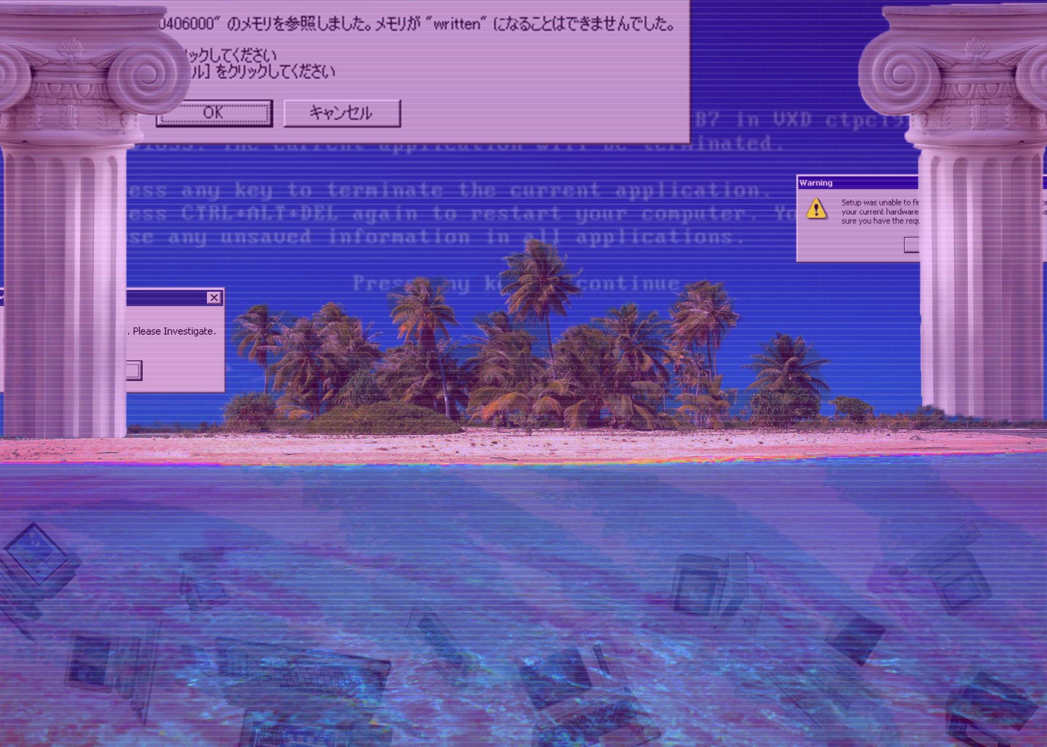
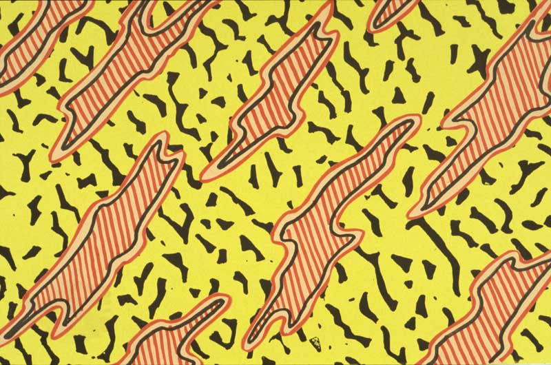
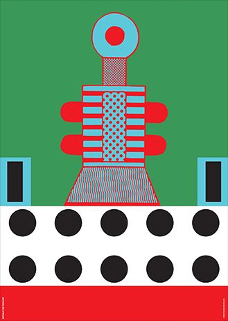
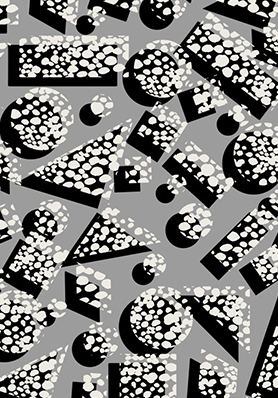
VAPORWAVE
Vaporwave is basically a music genre that started making rounds in Bandcamp, Youtube and 4chan tumblr and reddit early 2010. The music videos had aesthetic
and pleasing visuals, often trippy, derived from the 80’s and 90’s sub culture. It started of as an experimental electronic music
style which took parts from 80’s jazz, funk and new age genre and mixed and mashed together. Most notable song to define vaporwave
would probably be MACINTOSH PLUS — リサフランク420 / 現代のコンピュー (which means “Computing of Lisa Frank 420//contemporary).
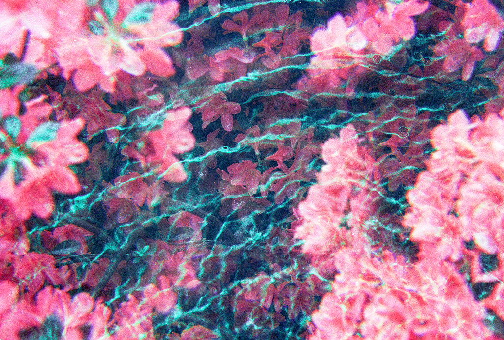
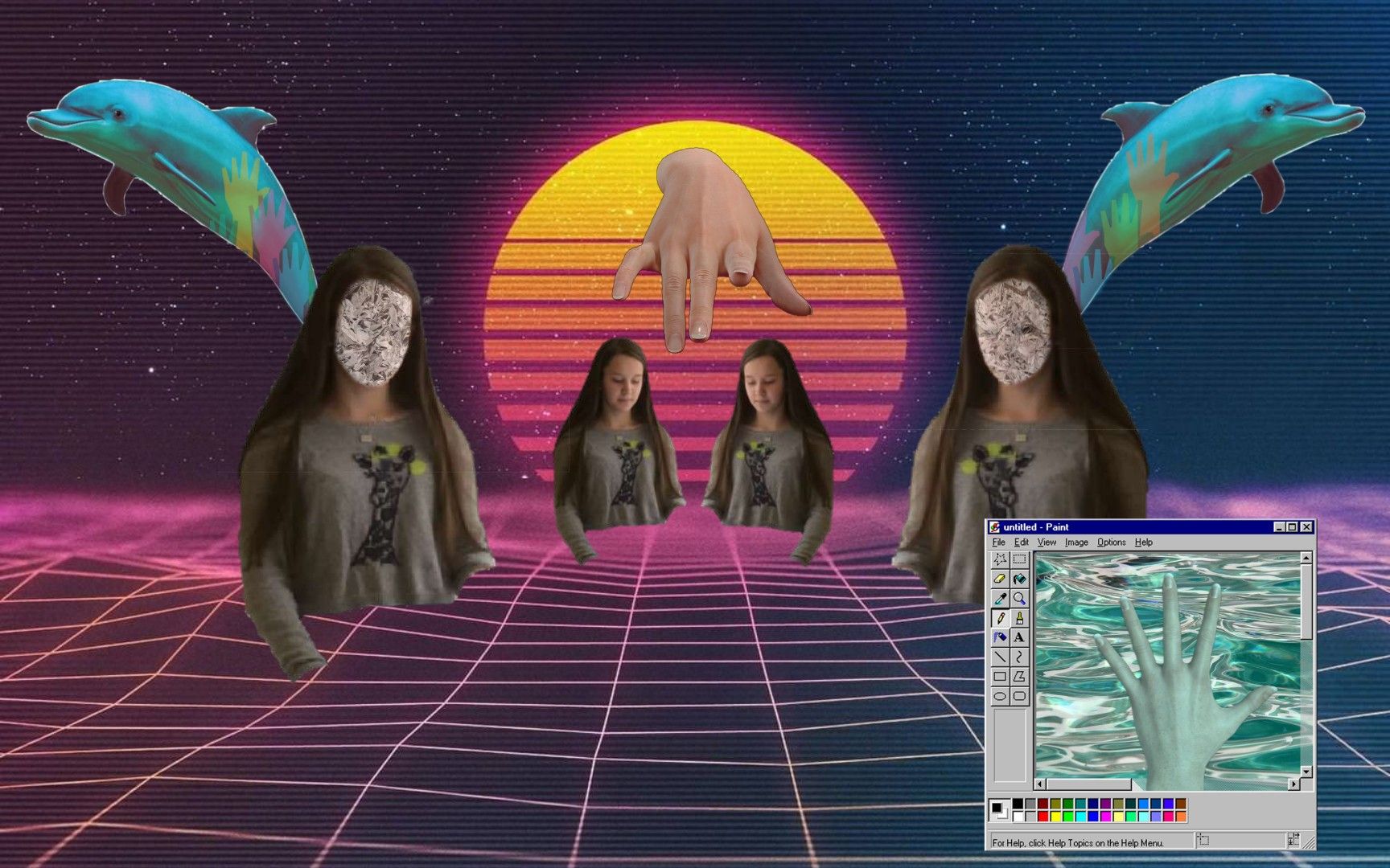
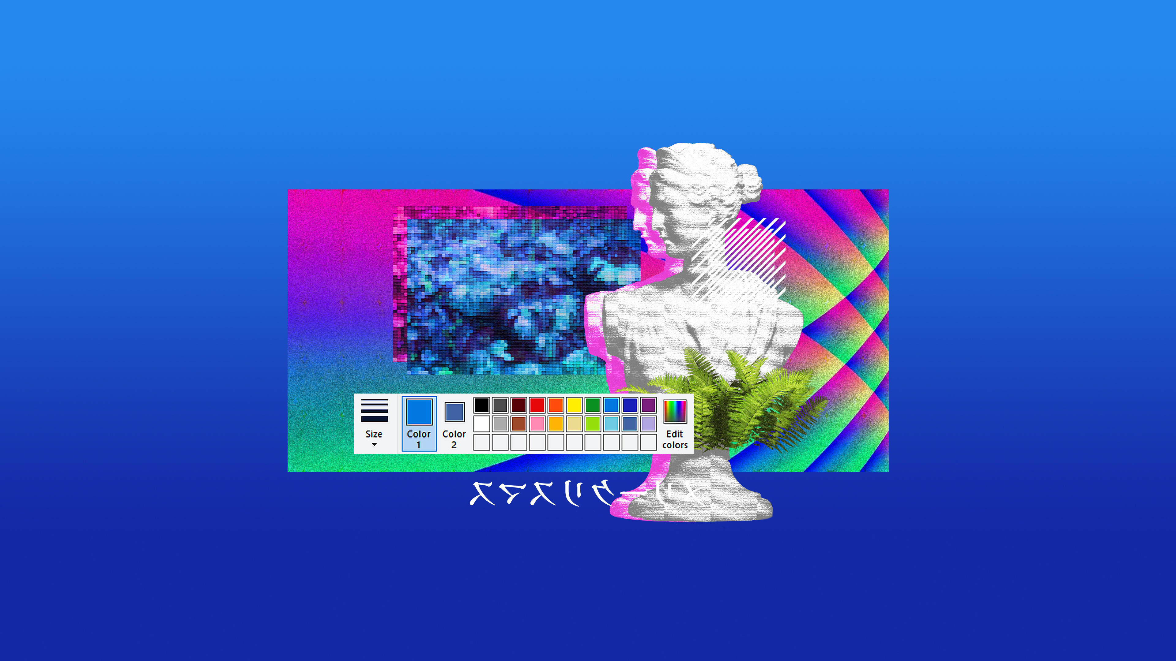
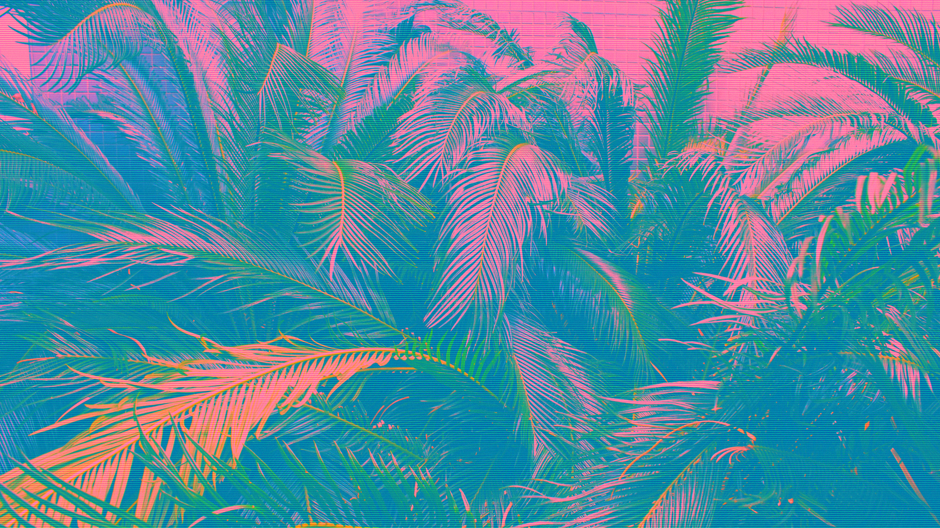
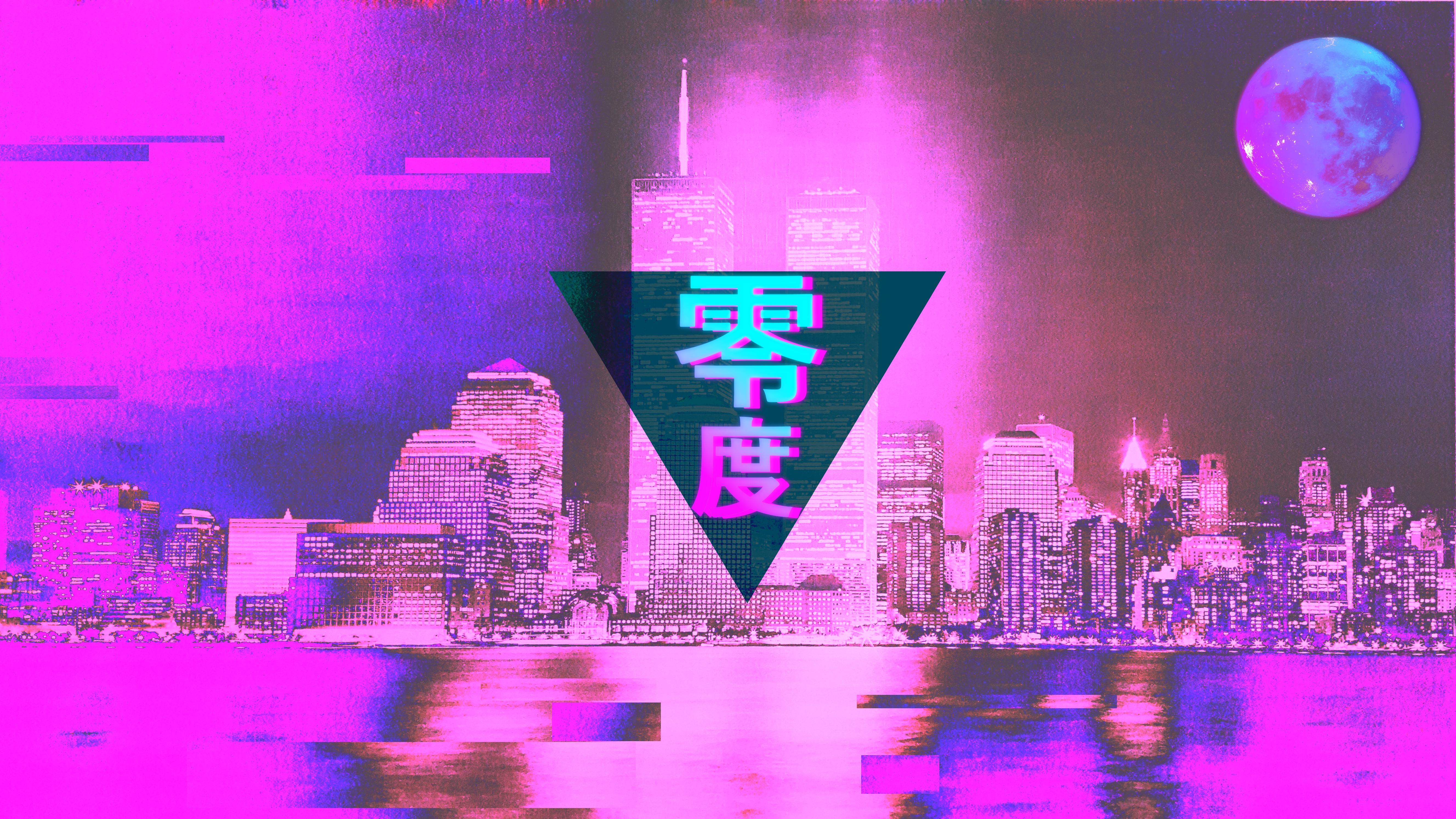
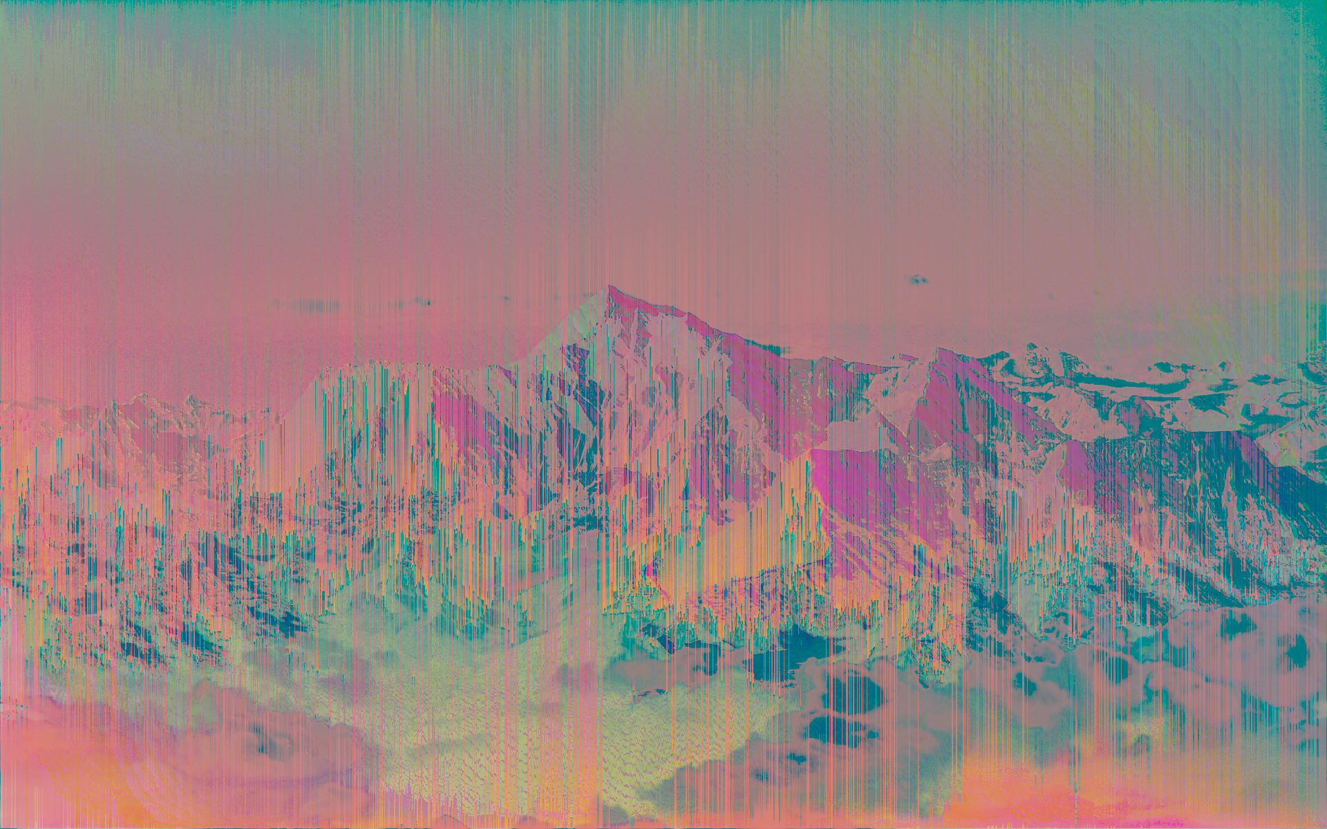
Now to talk about the visuals. Vaporwave artworks mainly consisted of heavily edited Glitched out photographs, Old graphic design styles (like Word Art),
Roman statues and figures, tropical elements (Palm trees, ocean, mountains, dolphins), Japanese culture (letterings, cityscapes), 8bit pixel art,
and for some reason arizona iced tea.
Even though mostly used in music and memes, this style provides a refreshing new take on retro artworks.
MUSIC
Diskette Romances - Fentanyl Flowers
Kenny G - Songbird
Chuck Person - A1
James Ferraro - Palm Trees, Wi-Fi and Dream Sushi
Macintosh Plus - リサフランク420 / 現代のコンピュー
B L U E - \\ Visual \\ // Entropy //
Internet Club - BY DESIGN
░▒▓【ALL CAPS AND αւτ kεÿ CΘᕸEᔕ™】░▒▓ - DAE le 90's Kid
骨架的 - life
Blank Banshee - Ammonia Clouds
Infinity Frequencies - Lotus Bloom
Eco Virtual - Cumulus Fractus
Hong Kong Express - Your drink, sir 鸡尾酒酒吧
식료품groceries - Aisle 3 (Summits, Clouds, and Greener Grass)
GOLDEN LIVING ROOM - DREAMS
Vaperror - Surf
Saint Pepsi - Cherry Pepsi -
マクロスMACROSS 82-99 - 水野 亜美AMY
Yung Bae - Bae City Rollaz (w/ИΔΤVИ)
Disconscious - Endless Escalation
猫 シ Corp. - B5 - Second Floor
死夢VANITY - nightlife
§E▲ ▓F D▓G§ - ASCENDING
THE DARKEST FUTURE - 無題
2814 - 恢复

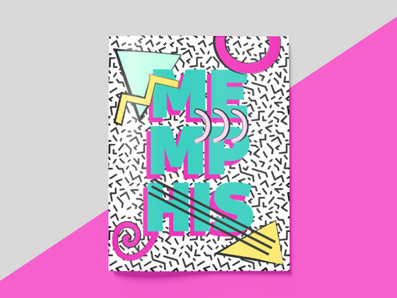
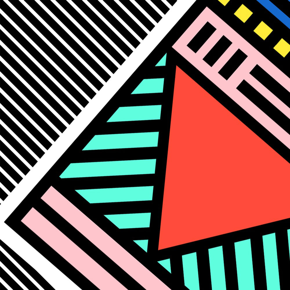
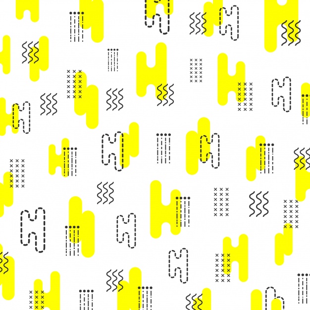
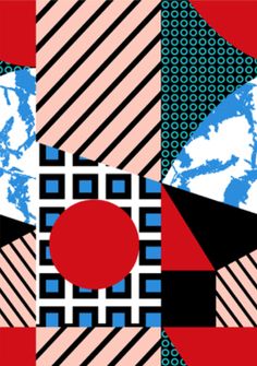
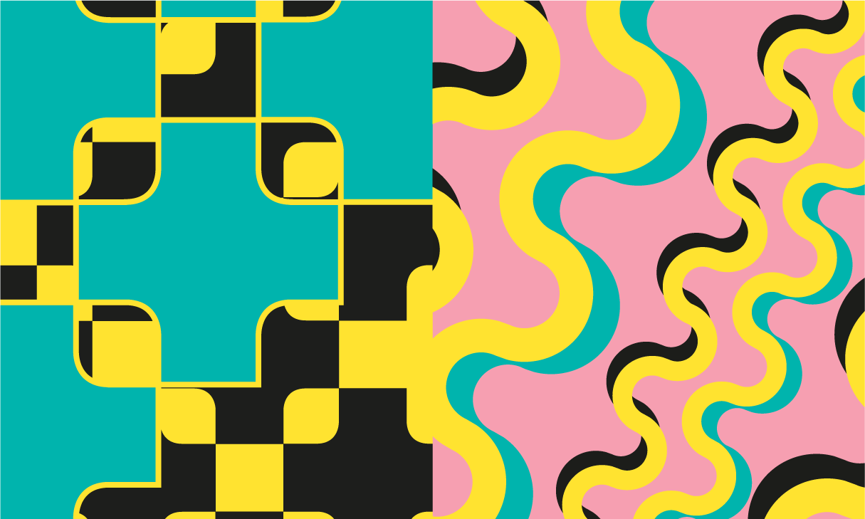
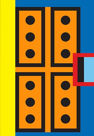
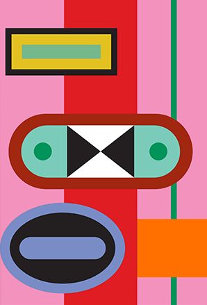
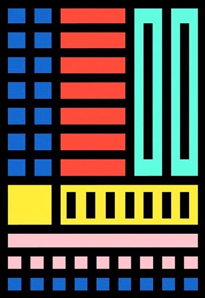
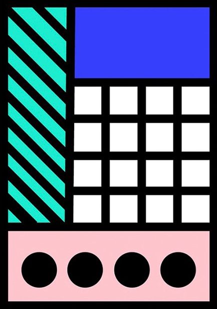
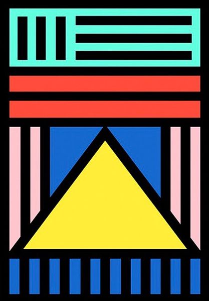
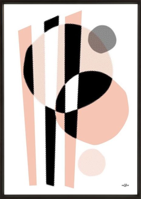
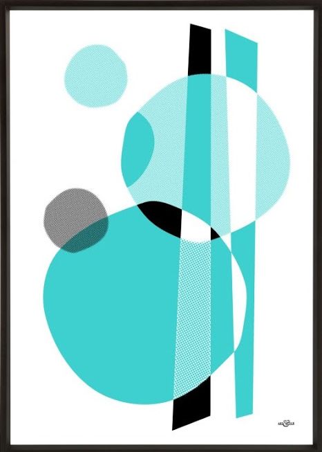
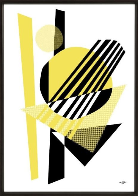
MEMPHIS
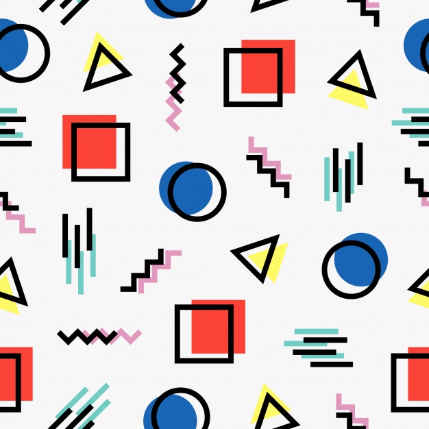
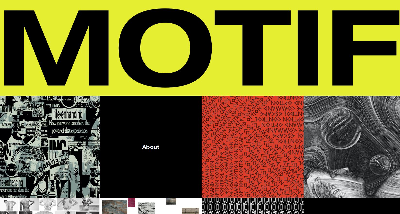
Memphis is a style right from the 80’s. It basically redefined the design industry and the decade, if you ask someone how was the 80’s like, they’d probably say colorful, and that’s what memphis is about, Bright bold solid colors with random geometric patterns and shapes layered on top of each other.
This style was basically introduced by the Memphis group, started in 1981 and led by the Italian architect Ettor Sottsass. Although based in Milan, Italy, they had architects and designers from all over the world. The name actually came from the lyrics of a Bob Dylan song which was being played during their meeting. Their art style derived from radical design in Italy which was fairly popular during 1960’s which basically tried to not follow the rules of modernism in architecture.
When you think about memphis, you’ll always see that its bright, its bold, its colorful, and beautiful af.
Nathalie Du Pasquier for Rubberband
Talking of Nathalie du Pasquier, her latest collaboration with Mumbai-based product design brand Rubberband has just launched and boy is it right up my street. A series of six wonderfully bold notebook designs, all with an apt inside of coloured paper and coloured thread detailing – something for you stationary fanatics! There’s also a digitally printed poster if you’re after something larger / have enough notebooks to fill a museum like I do. Interestingly, the collaboration has been a life-long dream of Rubberband founder Ajay Shah ever since he was a design student, which just shows you CAN get what you want. That’s a lesson to us all to keep on doing what we’re doing.
Pressed & Folded
One of my most favourite recent discoveries is Pressed & Folded, as you may have already seen in the February High Five. The design duo’s work fits perfectly into the Memphis trend but with a slightly more organic feel – less constructed lines and even more of a playful feel. These greetings card bring a sense of the bizarre and unusual, which is surely what Memphis is all about and certainly an alternative that I’d rather gift to my buddies on their birthday. Check out their full range for even more Memphis options with a twist.
Camille Walala
Walala is a welcome addition the streets and interiors of Shoreditch with her large murals currently donning and brightening up buildings in the area. Her mix and match style of monochromatic patterns paired with bold and bright geometric shapes as well as typography makes me feel a little happy inside – this lady surely is the modern day Memphis queen. Although I could certainly handle a whole wall of Walala, these neat prints make for the perfect addition to a gallery wall and you can choose from three different sizes depending on your wall needs.
Art & Hue
Art & Hue’s latest collection gives the nod to Memphis design whilst taking inspiration from 1950s jazz music too – what a combination! Described as “Saul Bass meets Ettore Sottsass”, these prints are slightly less in your face then the rest would work wonders for adding a pop of colour to a room. Sometimes it’s hard to justify the amount of art I buy to the boy, but when there is musical connotations involved everyone’s happy! The contemporary prints feature abstract shapes in Art & Hue’s signature halftone style (an age-old technique that uses dots to make up the printed image) and with the brand also heavily influenced by Pop Art these designs are certainly ticking all the boxes for me. Once again, the prints are available in a multitude of colours and sizes so make some space and bring some modern day Memphis into your home.
BRUTALISM
Brutalism generated originally from western Europe. Its a style of architecture that has smooth bold geometric concrete buildings. (Guess what hitler build in Berlin... lol) Well not all concrete buildings were brutalist, and not all brutalist styled buildings used concrete, but at that time, concrete was a cheap way to develop structures that in a way, made sense. The term brutalism started getting popular in the 1950’s when british architectural critics started using it.
You might think brutalism comes from the english word brutal but it’s actually derived from the french word Béton brut, which means “raw concrete”. Massive use of this style was very popular back then and if you look closely, many old public buildings such as libraries and govt. buildings were made in this style. Filmmakers like to relate brutalist buildings to a dystopian future, like how horror films relate to gothic buildings.
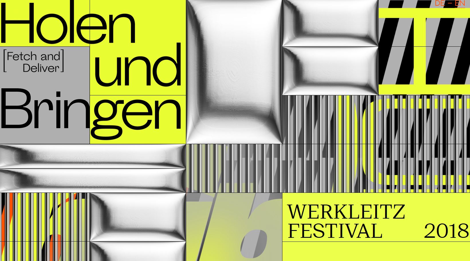
Now how does this relate to graphic design? Brutalism basically got reintroduced in web design again early 2016(look back at the beginning of first webpages, mostly now preserved in neocities) as an aesthetic approach to web design.
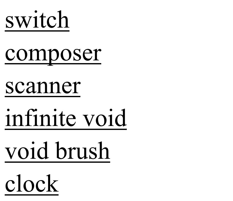
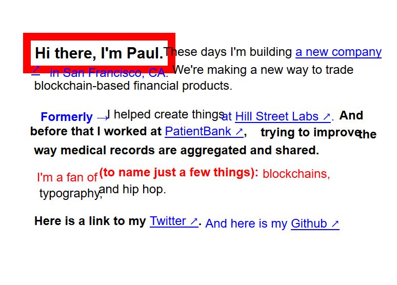
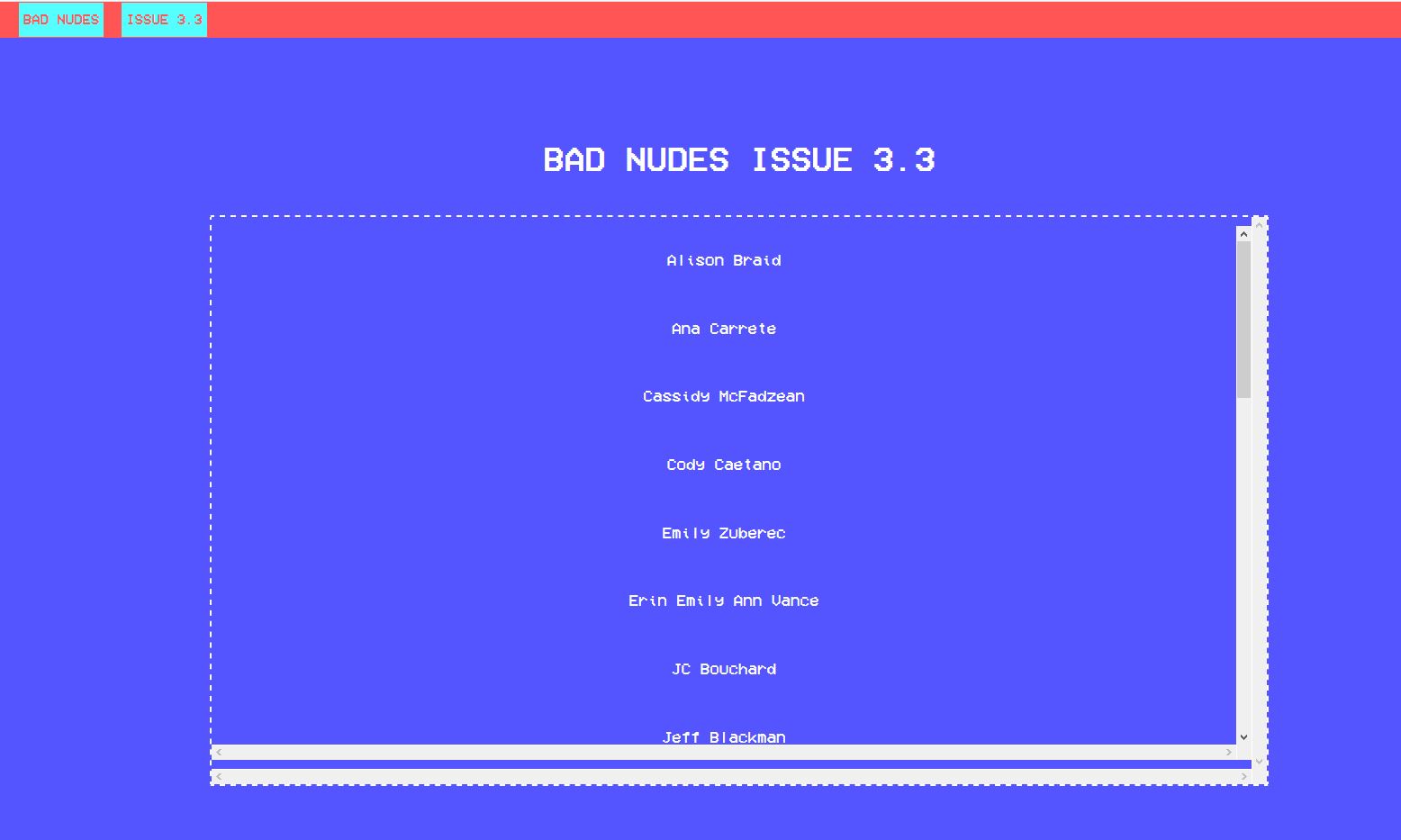
It’s designs include Bright Colors and Chaotic Clashing. Mainly this style of web design looks raw, like an html file with no css or javascript, just raw markup.
You’d see the typography being in monospace or minimalistic fonts alike, Brutalism in the Internet is a private and individual interpretation of the creator VS the visitor.
Making a site simply for style without content is useless, but not boring. Overusage of Brutalism is a personal experience, bright heads take this as an opportunity
and evolve their design skills.
and everything is scattered, with no specific rules for composition.
It makes you think that these look like mistakes which are unintentional, but if everything is executed properly, this type of style does not hinder
much usability apart from normal sites and provides a twist to the present format of web, which in my opinion gets kinda boring.
- youtube.com
- awwwards.com
- brutalistwebsites.com
- medium.com
- designshack.net
- youtube.com
- youtube.com
- creativeboom.com
- webdesignerdepot.com
- sosbrutalism.org
- artsy.net
- youtube.com
Sources
Here the fun begins. HAHA
Is an Image yours and you want to take it down? Please contact me under contact@rottenbeans.club